Website design for tech companies: 5 mistakes to avoid
For all tech companies, their website plays a key role in the customer buying journey. Your site needs to be set up to help convert visitors into leads and ultimately increase revenue for your business.
Even if you generate most of your business offline through networking or referrals, your website still plays a pivotal role. Customers will look at your website before buying from you. I guarantee it.
They want to see if you’re reputable, an authority, and learn more about your product or service. And your website is the perfect place to do this.
However, we often see the same mistakes cropping up on tech websites that stop them from achieving this. And if these were fixed, companies would see an increase in the business their websites generate.
In this article, I run through the 5 mistakes tech companies make with their website design. Here’s a quick overview:
- Not speaking to your dream customer
- Only listing features or specs
- Unclear call-to-action
- Selling instead of educating
- Poor site performance
Let’s dive in…
Mistake 1: Not speaking to your dream customer
This is the most common mistake we see. When tech companies are designing or redesigning their website, they do so without speaking to their dream customer.
But, why is this important?
Ultimately, your website is for your customers and not for you. It needs to use the language they use and it needs to solve their problems.
Of course, you want the website to look nice, be on brand, and reflect your company. But, at the end of the day, your website is for your customer.
On top of that, if you’re looking to attract a certain type of customer. Your dream customer. Your website needs to be geared towards them.

And you won’t know what they want to see unless you speak to them directly. As well as speaking to the people on your team who regularly talk to them. Such as customer service reps or your sales teams.
If your website is already live and you didn’t speak to your dream customer, that’s okay.
You can get their feedback and input on the current website. You can use this to make changes to the design, copy, and images.
This does take more effort than just designing your website based on what you like, or, what you think your customers like. However, it’s important that your website puts your customer's minds at ease that you are the best company for them.
By speaking to your dream customer, you’ll be able to find out exactly what they expect to see on your website and you can add this.
Mistake 2: Only listing features
When browsing a website, customers don’t care about all of the features or specs your product has. They care about how the product can benefit them.
This is especially true in tech. It’s easy to list out lots of technical specifications but your customers want to know how you can help solve their pain points.
There is a classic saying in sales… “features tell; benefits sell”
And this couldn’t be more true on your website. One example is the advertising campaign Apple ran when they first released the iPod.
They could have said “storage for 1GB of MP3s” but they lead with “1,000 songs in your pocket”. Which helps the customer realise just how amazing the product is and what it can do for them.
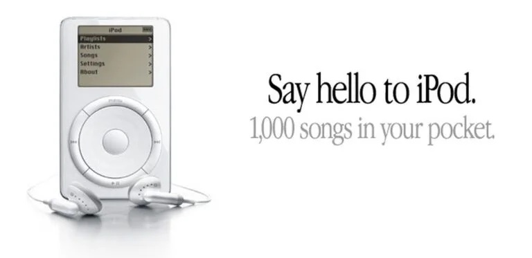
Photo credit: Apple
Here’s an easy way to distinguish between the two:
Features… are centred on how something works or what it does.
Benefits… talk about how it might improve your customer’s life.
You work day-in, day-out with your company so you know exactly what benefits you can bring your customers.
However, when a prospect lands on your website, this may be the first time they’ve come across your product. So you need to spell out to them just how you can make their life better.
It is tricky to separate benefits from features. But, if you can do this on your website, you’ll be ahead of most other tech companies. And your customers will appreciate you for it.
Mistake 3: Unclear call-to-action
A call-to-action is a word, phrase, or button that can be added to your webpage to make the audience act in a certain way and take action.
Firstly, you need to be clear. What action do you want users to take on your website?
Do you want them to phone you or use the contact form? Do you want them to sign up for a demo? Do you want them to download your whitepaper? Or explore your product range?
This action will vary from page to page but the premise is the same. By knowing what action you want the user to take on a page, you will be able to craft the perfect call-to-action.
Let’s take a look at the example below, there are too many call-to-actions here.

When I land on this page, I’m being asked to do too many things. Being pulled in too many directions. If GoTo wants me to “Explore Products”, then I would remove the other smaller, distracting call-to-actions on the bottom of the page. And keep the two clear buttons at the top.
This is one of the most common issues we see. Tech websites have too many call-to-actions or they have too few.
Think about the journey you want to take the customer on when they land on your website. Most customers won’t be ready to call you immediately or sign up for a demo. So how can you move them around your website and educate them further about you, your product, and the ways you can help them?
This brings us to Mistake 4…
Mistake 4: Selling instead of educating
The majority of your website visitors won’t be ready to buy from you straight away. On average, research has shown it takes 8 touch points to close a sale. That's 8 or more times a customer interacts with your business before they will buy. Be aware, that this stat is not industry-specific and will vary widely across different niches.
But, it makes a good point, that prospects will need to see that you’re an authority in the industry and that you can help them solve their problems. And this doesn't happen on the first visit.
To achieve this, you need to educate your prospective buyer. Yes, selling to them is important but it will only get you so far. People can sense when they are being sold to.
But, if you can educate and help your customers, improving their life in the process, they will remember you for it. And they will keep coming back to your website to learn more.
So, how can we educate our website visitors?
You need to help them on their journey and fix their pain points. Your target customers will have a list of recurring problems as long as their arm.
These will be very specific problems so you need to go out and speak to your target customers, as mentioned in point 1, to find these out.
Then based on this, you can produce content to help them solve these problems. Weaving this into the messaging on your website. Referring back to Mistake 2 in this post, listing benefits not just features or specs.
A tech company’s aim is to support your target customer in any way possible and the content on your website is a great way to do this.
So next time you’re looking to put up a page or blog post on your website, try educating your customer and solving their pain points instead of selling to them.
Mistake 5: Slow performance
Not technically a part of a tech company’s website design, but website performance deserves an honourable mention in this list.
Over the years, Google has continuously emphasised the importance of webpage speed. In 2021, they released an algorithm update based on a new initiative called Core Web Vitals. A set of metrics that apply to all web pages and relate to the speed they load.
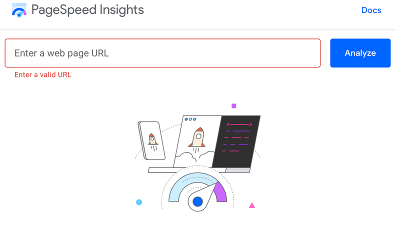
This gave every website 3 areas to focus on and improve. You can view your scores in your free Google Search Console account, or you can test any website here.
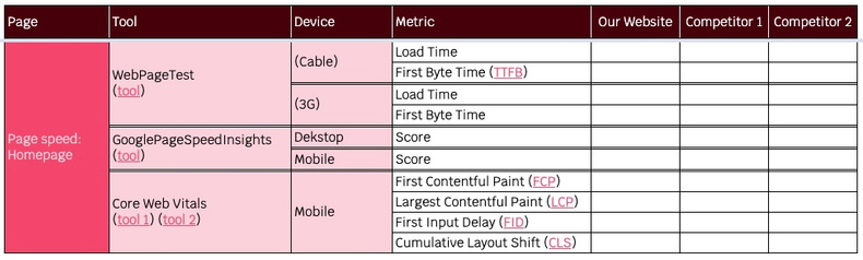
One of our favourite page speed tools is WebPageTest. This is more complex than Google’s tool above, but you can access more information about your page speed. It is a little more complex than Google’s tool, so Moz have a great guide on how to read the charts and get the most out of WebPageTest.
So what, is a good page speed score?
This is a great question and one we get asked a lot!
First off, I’d compare yourself to your competition. We use a table similar to the one below to compare our site speed to other websites in our niche. Across a range of tools, looking at a range of metrics. Such as load time, Time to First Byte, and the Core Web Vitals metrics mentioned above.
As a bare minimum, you want to be quicker than the competition. That’s a must.
But, let’s say you’ve optimised your website and you’re now quicker than them. Now what?
In short, it’s just continuous gains from here on in. There are always smaller tweaks you can make to improve your site speed. And one big factor for tech companies is when new plugins, imagery, or sections go up on your website. These can slow down performance if not tested.
So, a lot of the time, it’s about keeping and maintaining your current site speed score. And not doing anything to cause this to drop. Which is harder than it sounds.
We recommend testing your speed every month. Or, after you make a change to your website. Even small tweaks, like adding a cookie consent banner, can have an impact on site speed.
Summary
There we have it! 5 mistakes we see tech companies make with their website design.
By addressing these, tech companies can get the most out of their website. Providing a better user experience and improving the perception of their brand in the market. And they will see an increase in the business their sites generate.
If you'd like to read more on this topic, we dive into 11 tips for B2B web design as well as listing 5 places B2Bs can go for inspiration when designing their own website.
If you have any questions about this post, you can reach out to me personally on LinkedIn and I'll answer any questions.
Spaced Digital is a B2B marketing agency based in Brixton and Cambridge. We can help tech companies based in Cambridge with their web design and digital marketing.